
Working with Watercolors
- Laura

- Sep 4, 2020
- 4 min read
In elementary and middle school, I would use watercolors every now and then, but eventually I just became frustrated with how pale the colors would always turn out... like this one:

So for a while after that, I never really wanted to try watercolors and thought I didn't like them. I thought they were pale, hard to control, and not good for detailed, realistic paintings—which is what I like to draw and paint. I thought they were always super watery and bled into each other without much control.
But then I remembered a watercolor kit I had gotten from a friend. It had tubes of paint rather than the little hard circles I was used to in elementary school. Who knew what a difference that could make.


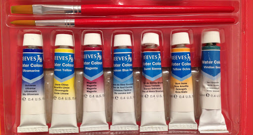
The kit also came with a little booklet that had some step-by-step paintings, so I decided to try one. I didn't follow the steps exactly as in the book, but I mainly used it as a reference for the colors. The names of the colors were mostly new to me, and I wanted to know what to mix to get the colors I wanted.

I was very pleasantly surprised with the vibrancy of the colors and the amount of detail I was able to include. The paint was easier to control than I thought and was actually a lot of fun to work with. Another plus was that since watercolors are water-soluble, I could reuse whatever paint had dried just by wetting it. It was nice not having to scrub off and waste whatever extra paint was left like I have to with acrylics.
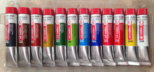
Then about a month ago, a found a really nice art store that had more than just the kids' school-type art supplies that I've mostly found. It had three whole floors, the top one with kids level supplies, the bottom one with hobby materials like ceramics and knitting tools, and the middle floor with what seemed like every kind of art supply you could think of—pencils, pens, markers, paints, watercolor pencils, erasers, paper, and it seemed to go on. I spent a good bit of time in that store...
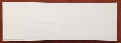
I found a pad of watercolor paper there, and they were meant to be postcards. I thought that was a really neat idea and wanted to try making my own postcards, so I got that along with some more watercolors to expand my color choices.
I was very excited to try out the postcards, but I wanted to do some planning and experiments first so that I knew what scene I was going to draw on each postcard, and also so that I could try out the watercolors a bit more first. I made practice paintings on normal paper the same size, but I still made them quite detailed so that I could get an idea of what the final painting would look like. This way I was also able to see just how much detail I could get in with the watercolors.
The first practice painting was a horse pulling a cart of produce that a man is selling, and they're stopped on the street as another man comes to buy some of the produce.

First I painted in the base colors, like a solid area of red for the tomatoes, a general layer of brown for the horse, etc. Then I slowly went back in and added details like the highlights and shadows on the tomatoes, the reigns of the horse, the clothing, and the other details of the people and vegetables. One thing I did learn through experimenting was that some colors layer better than others. For example, I tried to paint the eggplant with a layer of purple and a few strokes on top for the green stems. The green didn't turn out as light and obvious as I had hoped though, so for the actual painting I'll paint some spots purple and some spots green to avoid the layering. Once the horse, cart, and people were done, I used some of the gray, watered it down, and painted a little bit of shadow underneath everything just to suggest the street.
The second practice painting was of Merkez Park in Adana, Turkey.

I started with the mosque at the very back and center, using tans and grays, and then I painted the small globe right in front of that. One aspect of watercolors I've really loved is how detailed I can make it and how smoothly the brush runs along the paper. I was able to include all the little windows, arches, and tips of the minarets because of this. After this, I painted the sky using a slightly wider brush. Since I only used printer paper for these practices and since I used a good bit of water on the sky, it made the paper a little grainy. With the sky done, I used the bigger brush again to lay in a faint layer of gray on the path. I added greens, yellows, and browns to the grass, trees, and bushes in the middle. To finish, I painted the faint red lines on the path, the benches and lampposts, and the flowers in the middle.
I'm really looking forward to creating a whole set of watercolor postcards like this, and it will probably be my main project for the next while. After that, I'm excited to see what else I can do with watercolors!


These paintings are so amazing Laura! I can't believe how much detail you were able to add in your painting of the park. Similarly to what you were saying, I always was frustrated with how pale the colors were with this type of paint and how I couldn't really control where it all went when I tried using it. I've actually been getting back into watercolor painting a bit lately, using watercolor pencils because that's what I had lol, and now I kind of want to see if I can find some in tubes like what you were able to find! Great job :)
~ Emma G