
T-Shirt Design
- Laura

- Mar 5, 2021
- 3 min read
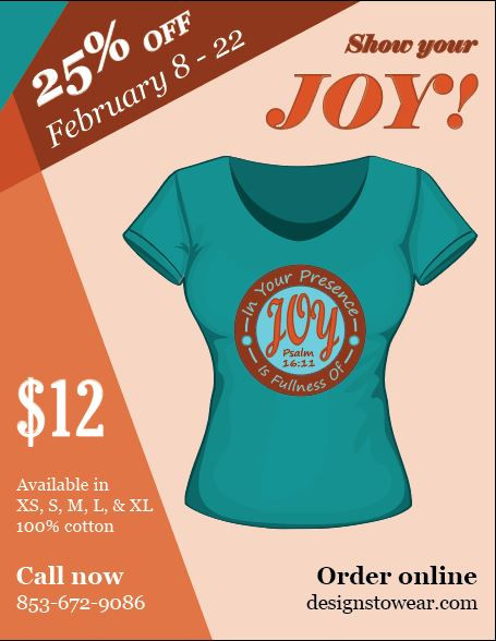
In January and February for my graphic design class, we worked on designing T-shirts with a Bible verse on them. I knew I wanted mine to have a verse from Psalms on it, particularly to do with either God's glory or the joy found in Him. I finally settled on Psalm 16:11, which says, "In Your presence is fullness of joy".
I wanted it to have a feeling of joy to it, so something bright. I also knew I wanted some of the letters to be cursive, since in cursive it seems like the letters are dancing. An idea I had for the shape of the design was a circle, since it seems complete and contains all the words inside of it, just like our joy is complete in God. I wanted the word "joy" to stick out the most, of course, and there were multiple ways I could do this: putting it in the center, putting it in all capital letters, using a different font for it, or making it a different color or size.
The next step was coming up with a couple sketches and thinking of some possible color schemes.


I decided on the second layout with all the words wrapping around "joy", and it also seemed more interesting and well-balanced. As for the colors, I really liked how bright and bold the blues, orange, and red were, and they seemed to go together really well.
For the fonts, I went with Segoe Print for most of the design, and Script MT Bold for "joy".

With these elements planned out, it was time to start on the design digitally. I played around with different combinations of where each color would go, and I also tried a few options with one of the other color combinations just to see if it would work or not.

I went with the option on the bottom right because it had the best contrast and was the easiest to read, and I really liked the red against the blue.
The next step was to get some feedback from the class, and we decided that the dots on the edge of the circle seemed a bit unnecessary to have so many of them, so I cut it down to one dot on each side.
The second part of our project was to create an advertisement for our T-shirts and place our design on a T-shirt mock-up. I decided to keep the same color scheme to give it a sense of unity. First though, I needed to decide what information would go on the flyer. I included a slogan, "show your joy", a sale announcement, the price, the material, the sizes it would be available in, and a phone number along with a website for contact information. Then I tried out two layouts.

While I liked the look of the banners with information going across the first design, it seemed like it was boxing the shirt in too much. In the second design, however, the bands of color on the left side seem to frame the shirt without trapping it, and so I went with this one. It was cleaner looking and drew more attention to the shirt.
Next I got more feedback from my class and made a few adjustments. I unitalicized "Call now" and "Order online", and I reversed the bolding for the contact information. I also added some small lines around the circle next to the dots since it seemed a little empty, but made more sense than having three dots on each side.
And with that, I completed my project! If I were to make anymore changes, I think I would adjust the lines next to the dots a bit so they look more even. Overall, this was a neat project to create something practical that could actually be printed out and worn, and I really enjoyed it!


Comments