
Media Experimentation: Part 4
- Laura

- Apr 2, 2021
- 2 min read
For my fourth media and texture experimentation series, I decided to try drawing fur. Initially I was going to use a stuffed animal as the subject, but I ended up using a fluffy sock instead. I thought some interesting media for fur could be graphite and charcoal, white charcoal and normal charcoal on gray paper, and chalk pastels.

I started with the graphite version, using charcoal mostly just on the darkest spots and shadows.


First I sketched the outline of the sock, marking the shadows and the spots on it. Then I filled in the darkest spots and shadows with charcoal and a little bit of graphite.


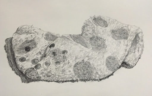
I filled in the spots with a light layer of graphite, and then I went over the whole sock with soft little scribbles to give the fur effect. Finally I went over with more scribbles, this time using the point of the pencil to create sharper strokes.

Next I worked on gray paper using charcoal for the darker-than-average parts and white charcoal for the lighter-than-average parts.


I again began with a sketch, and then I started shading in the darker parts, such as the shadows, the little spots, and the folds in the sock. I made some darker strokes for some of the fur in the shadows.


Then I went in with the white charcoal, creating strokes in the lighter areas. I also used the white charcoal to create some of the edges of the sock, since the white would stand out against the gray background. Finally I used a bit more of the black charcoal to make the spots a little darker and to create more contrast.
Finally, I created a colored version of the sock using chalk pastels.


After sketching it out, I filled in the colored spots with some blue, purple, pink, and gray.


Then I colored in the shadow with some brown and black. For the fur look on the sock, I took the gray pastel and created little strokes in some areas, and I filled in larger areas that had shadows. I also added some black and purple to these darker shadows such as where the folds were. Finally I colored in the big spots with purple and some pink, and I used the corner of the purple pastel to create the darker strokes on the spots. I also added some more black and gray to the shadow of the sock to create more contrast and make it a little less brown.


Completed drawings
Each version I think worked pretty well and achieved a furry, fluffy look. I think overall the black and white charcoal on gray paper created the most interesting look because of the contrast and the precise strokes. On the graphite version the sock lost some of its whiteness since I kept adding gray strokes to create the texture. With the white charcoal though, I was able to create texture while adding white, which helped to keep the color of the sock accurate.
While the pastels offer more interesting colors, it was harder to create precise lines, whereas the tip of the white charcoal pencil could be used for the strokes and threads of the sock. The white and black against the gray background also creates an interesting contrast, making it the one that I think worked best overall.


Comments