
Media Experimentation: Part 3
- Laura

- Feb 5, 2021
- 3 min read
Up next in this media and texture experimentation series is metal, so I picked out a small metal spoon to keep the shape itself simple. Drawing the shape actually ended up more challenging than I thought it would be, especially trying to get the shape right at an angle with the curves and ellipse. In the reflections on the spoon are a box with colored stripes and a picture frame on the wall.

The general set-up, though the angle changed slightly for each version
As for the media, I particularly wanted to make some comparisons and see the similarities and differences in colored pencils, watercolor pencils, and watercolors. I began with the version in watercolor pencils.


First I sketched out the shape and lightly erased some of the lines that were too dark. I noted where the main shadows would go and where the colored stripes would be. I started with the shadows so I would know how dark to go.


Next I filled in the inside of the spoon, using black, a very dark brown, a reddish-brown, yellow, and a light blue. The last step was just to wet everything to give it that water-color effect. I noticed that the wetting made everything considerably darker.
The second version I did with normal colored pencils.


I started in the same way with a light sketch and the shadows. I noticed that the shadow under the spoon wasn't all gray or black but had a slight yellow-brown tint to it, so I colored this in first.


Then I added the colored bits and darkened the shadow underneath the spoon. Finally I filled in the rest of the spoon with a black pencil for most of the shading. In this one the shape of the spoon was a bit off, but I did like the added brown to the shadow.
Finally I painted the watercolor version of the spoon.


Just like the previous two times, I started with the light sketch, and then worked on the shadows. I kept the yellow-brown as a base color in the shadow for this one. Then I used a light blue, brown, and yellow for the stripes. I defined some of the edges a little more with a darker stroke of the black.

After that I mostly only used black. I darkened the shadow and filled in the rest of the spoon, leaving some areas to fade to white and darkening some areas such as the dips in the middle of the spoon.


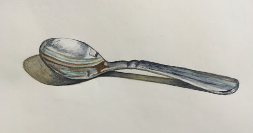
The watercolor version seems to have turned out the best yet again. In the watercolor pencil version, it turned out darker than I had planned, and it was a little hard to predict how much the colors would darken once wet. With both the water color pencil and the normal colored pencil ones, the colors also blended into each other more than I had planned and the layer of gray over the whole spoon to mute the brighter colors made it a little muddy looking.
In the watercolor version though, I was able to mute the bright colors while still keeping the crisp look of the spoon. It looks cleaner and smoother, just like the metal should. I was also able to create smoother transitions in the shading with the watercolors than with the watercolor pencils and was able to create a darker shade for the shadows with watercolors than with colored pencils. In addition, I think the shape of the watercolor version is the most accurate. Overall, it seems to be the most accurate in shading, texture, and shape.


Wow!