
2D Design Class Progress
- Laura

- Oct 29, 2021
- 5 min read
With October coming to an end, I'm just over halfway through my semester-long 2D Design class. I wanted to take a look at the work I've created so far and what I've been learning as well as new techniques or styles I've been trying.
We've been going through the various elements and principles of art and taking an in-depth look at each. The first week, we looked at line, and our project was to create rhythm using line. I played around with several different ideas, from a grid style with straighter lines to a more circular style with a different pattern within each circle. I ended up really loving the rhythmic effect of concentric circles inspired by tree bark. I decided to create a piece base on these lines, and I also divided the paper into strips to create even more of that tree look without necessarily creating a realistic piece.
I thought it looked a bit boring when I was done, so I thickened the lines between the "trees" to add a bit of variation in the lines. I also filled in each of the center shapes, and I think this was really effective to create darker values and points of interest to move the eye around the piece.

Week 1
The second week, we took a look at shapes, and our project was to use shapes to create a piece that represents us. I had to do a lot of brainstorming on this one to even figure out what would represent me. I decided that I would do a piece with lots of different layers since I have a lot of different layers that show depending on who I'm with. The top layer is just the surface facts about me, in this case the fact that I've grown up in a different country. The world map on this layer shows that my home is all around the world, and it is made up of lots of different pieces.
The next layer begins to reveal some of my interests and what I love. I chose to represent this with a starry sky behind a picnic basket weave, dotted with flowers, all things that I love. Behind that is where more of my personal expression begins to show, as well as my love for music. Though it can take me a while to start showing my songs to people, they are also the way I best and most boldly express myself, which is why I chose to use bright oranges and yellows in this layer. Finally, a tiny sliver of the last layer shows, which represent the thoughts and emotions that few people see and that don't come out much.

Week 2
In the third week, we moved on to form and how to create 3D shapes on paper. Our assignment was to draw a still life of fruit or vegetables with chalk pastels. Finally we had a project that was more my style - drawing from observation in a realistic style. But parts were still new. I had never used chalk pastels to draw something from life before, only from photographs. I really enjoyed this one and figuring out what colors to use to create highlights and shadows. For example, using purple in the shadows worked well. The texture of the onion was also really fun to capture.

Week 3
In week four, we discussed space, including positive space - the space taken up by the subject - and negative space - the space around the subject. It's important to consider both positive and negative spaces when creating art, so to study this we created a notan. This is a piece created by cutting shapes out of a piece of usually black paper and flipping it over to glue onto the white background. I thought that the shapes of the Istanbul skyline from our window would be interesting, especially the huge communications tower on the top of the hill. I also included one of the mosques.
Then I had the idea to combine some landmarks of Adana, where I used to live, into the same skyline, almost as if to combine the two cities into one. So I put in the famous clocktower and ancient stone bridge from Adana. Lastly, I put the moon and star from Turkey's flag in the sky where there was a lot of negative space. I used an xacto knife to cut all the tiny pieces out and then glued them, reversed, on to the other side. I love the strong contrast this method creates, and though it wasn't realistic like I usually prefer to work, it was still representational.

Week 4
The fifth week, we studied value and how it can create depth in spaces. We were given a project to create a portal between two different spaces using a variation in values. Inspired by the independence I've gained by the metro here in Istanbul and all the places I can go on it, I created a piece where the metro is a portal. Each door of the metro leads to a different place, filled with color and friends and nature.

Week 5
In week six, we got to texture and how it can create a lot of visual interest in a piece. Our assignment was to create an urban piece using texture for visual interest. I was again inspired by Istanbul and the famous trams on Istiklal street. To incorporate texture, I added details to the buildings, and I also used a splatter technique on the ground. This created a gritty look on the ground while making the space more interesting. Though unlike my usual, very precise style, I really had fun with this technique and like how it turned out.

Week 6
In the seventh week, we went over color and color theory. We discussed various color themes as well as warm and cool colors. We had the option to create either a creative color wheel or a piece exploring the contrast between warm and cool colors. I went for the second option and decided I wanted to create a more abstract piece for once to focus on just the colors. I still based it loosely on a photo, but it helped me to experiment with a more abstract style that was new. I referenced a photo of a river and mountains from the view of an airplane window. I exaggerated the colors to emphasize them more, with a strong, cool blue strip wandering through a warm, orange-pink terrain.
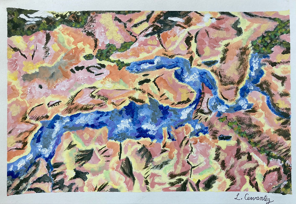
Week 7
Finally, on week eight, we talked about pattern and how we could incorporate it into our work. We were given a formula challenge this time with very specific instructions. We needed to have a foreground and background, an animal in the foreground, distinctive patterns in each space, a color scheme we could name, and an element of collage.
Once again inspired by Turkey, I created an image of a cat sleeping in the Grand Bazaar of Istanbul. However, on the walls of the Grand Bazaar I created a pattern inspired by Turkish pottery designs. On the cat and on the Turkish lamp hung from the wall, I created the mosaic-like pattern of Turkish lamps. My color scheme was complementary colors with the oranges contrasting the blues. My element of collage was words from an article about the Grand Bazaar printed onto a piece of paper, which I then glued to the ground. I lightly painted over this to make it a bit gray. This was again a combination of realism and abstraction that I enjoyed working with.

Week 8
These eight projects sum up what I've been learning in the first half of this semester, as well as the new styles and techniques I've been experimenting with while keeping my own personal style. I can't wait to see what else I learn and create by incorporating what I learn into my work!


I recognized the Adana skyline, and love the cat in the bazaar !! beautiful all of it!